Let's Talk
Quick Start Guide: Get started editing your website with this easy-to-follow guide.
Support: Explore Webflow University's library for comprehensive video lessons on getting started.
Useful links from Webflow University:
Before Publishing: Delete unused sections/pages, clean up CSS classes, clean up unused interactions and delete unused components.
Breakpoints: Check how your changes behave on different devices by clicking on the top bar of the viewport.
Backups: Restore previous versions from the Backups section in the left sidebar and clicking Settings in case of accidental deletions.
Editing Images and Text: Edit text by double-clicking on static content or use the CMS section for dynamic text. Replace images easily by clicking on them and choosing "Replace Image."
Dynamic Content (CMS): Learn how to manage and update dynamic content using the CMS, which instantly updates referenced content across pages.
Components: Utilize reusable components for efficient editing and consistency across layouts.
You can find all the GSAP attributes, GSAP connected Webflow variables and how to turn off GSAP here. This gives you powerful customization options to change this template in a major way.
All GSAP animations are controlled by attributes. You can find all the attributes in bold below.
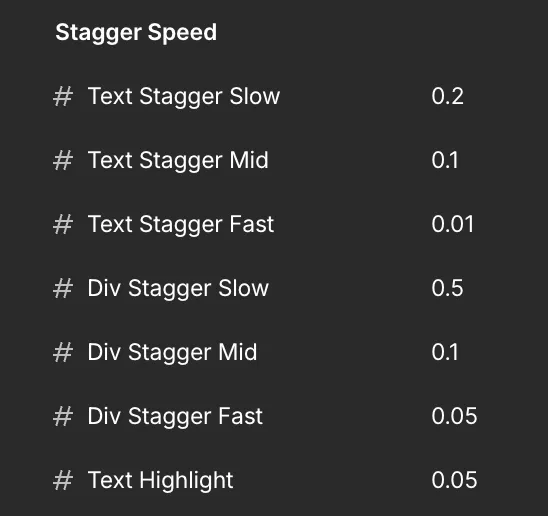
data-gsap-stagger-fast: Staggers text at a fast speed
data-gsap-stagger-mid: Staggers text at a medium speed
data-gsap-stagger-slow: Staggers text at a slow speed.
data-gsap-stagger-center-on-scroll: Staggers text from the center on scroll
data-gsap-stagger-divs-fast: Staggers the direct child div at a fast speed
data-gsap-stagger-divs-mid: Staggers the direct child div at a medium speed
data-gsap-stagger-divs-slow: Staggers the direct child div at a slow speed
data-hero-thumb: Thumbnails slide in from the right on load; on hover the active one scales up and the rest scale down.
data-hero-full-image: Full image reveals with a clip‑path + rotation when its thumbnail is hovered.
data-work-wrapper: Scroll trigger for work items.
data-work-image-wrapper: Work image reveals/hides via an animated clip‑path while scrolling.
data-text-path: SVG text travels along a path on scroll.
data-work-tag: A floating tag follows the cursor inside the work wrapper, fading in/out on hover.
data-cta-grid: Pinned CTA section.
data-cta-grid-image: Grid images fly up with a 3D tilt, in random order.
data-cta-grid-overlay: Overlay fades in.
data-cta-title: Title characters rise into place.
data-cta-button: Button fades and slides up.
data-hexagon: 3D hexagon auto‑rotates on the Y axis and can be dragged to spin.
data-hexagon-tag: A floating tag follows the cursor inside the hexagon wrapper, fading in/out on hover.
data-scroll-text: Text scrolls horizontally across the screen on scroll.
There are Webflow variables for some of the GSAP settings. You can customize this template without ever looking at a single line of code.
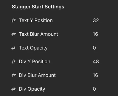
This sets the inital settings for the text & div staggers.
In the case of the text staggers - each character of a paragraph will start at 32px below (Y Position), 16px of blur and 0 opacity.
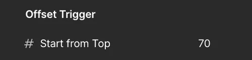
This sets when the text & div staggers are triggered from the top.
For effects without variables, change the numbers in the code.
gsap.fromTo(introHeroThumbs, { xPercent: 1280 }, {
  xPercent: 0,
  duration: 3,     // ← seconds the thumbnails take to slide in
  stagger: 0.05,   // ← gap between each thumbnail
  ease: "smooth",  // ← motion feel (see eases below)
  delay: 1         // ← wait before it starts
});
To speed the intro up, lower duration (e.g. 3 → 1.5).
To start sooner, lower delay (e.g. 1 → 0).
Ease — accepts any GSAP ease string: "power2.out", "sine", "none", or the custom "smooth" ease defined near the top of the code.
Swap the string to change the feel.
scrollTrigger: {
  trigger: el,
  start: 'top bottom',       // when it begins
  end: 'center center-=25%', // when it finishes
  scrub: true                // ties progress to scroll
}
scrub: true links the animation to scroll position. Set a number (e.g. 0.5) to add smoothing, or remove scrub for a one‑shot play on enter.
scrollTrigger: {
  trigger: grid,
  start: 'center center',
  end: '+=250%',   // ← lower = shorter scroll distance (e.g. 150%)
  pin: grid.parentNode,
  scrub: 0.3,
}To remove it from one element only: delete its data- attribute (e.g. data-gsap-stagger-slow) in the Designer. No code change needed.
1. Open the custom code in the site settings.
2. Scroll to the DOMContentLoaded block at the bottom and find the matching line. Comment it out // per line.
// if (gsap.utils.toArray('[data-gsap-stagger-slow]').length > 0) {
//   animateStagger('[data-gsap-stagger-slow]', textStaggerSlow);
// }
3. Each GSAP effect lives inside its function, so disabling the function removes its trigger too — nothing else to clean up.
- Scroll effects (work clip‑path, scroll text, center reveal, CTA grid) will simply appear instantly in their final position instead of animating.
- Looping ticker (data-gsap-stagger-loop) becomes static text once removed.
This provides smooth scrolling across the entire template. To turn off just comment out this code.
// Initialize Lenis smooth scroll
const lenis = new Lenis({
    duration: 1.2,
    easing: (t) => Math.min(1, 1.001 - Math.pow(2, -10 * t)),
    smooth: true
    });

    // Connect Lenis to GSAP ScrollTrigger
    lenis.on('scroll', ScrollTrigger.update);

    gsap.ticker.add((time) => {
    lenis.raf(time * 1000);
});

gsap.ticker.lagSmoothing(0);

});